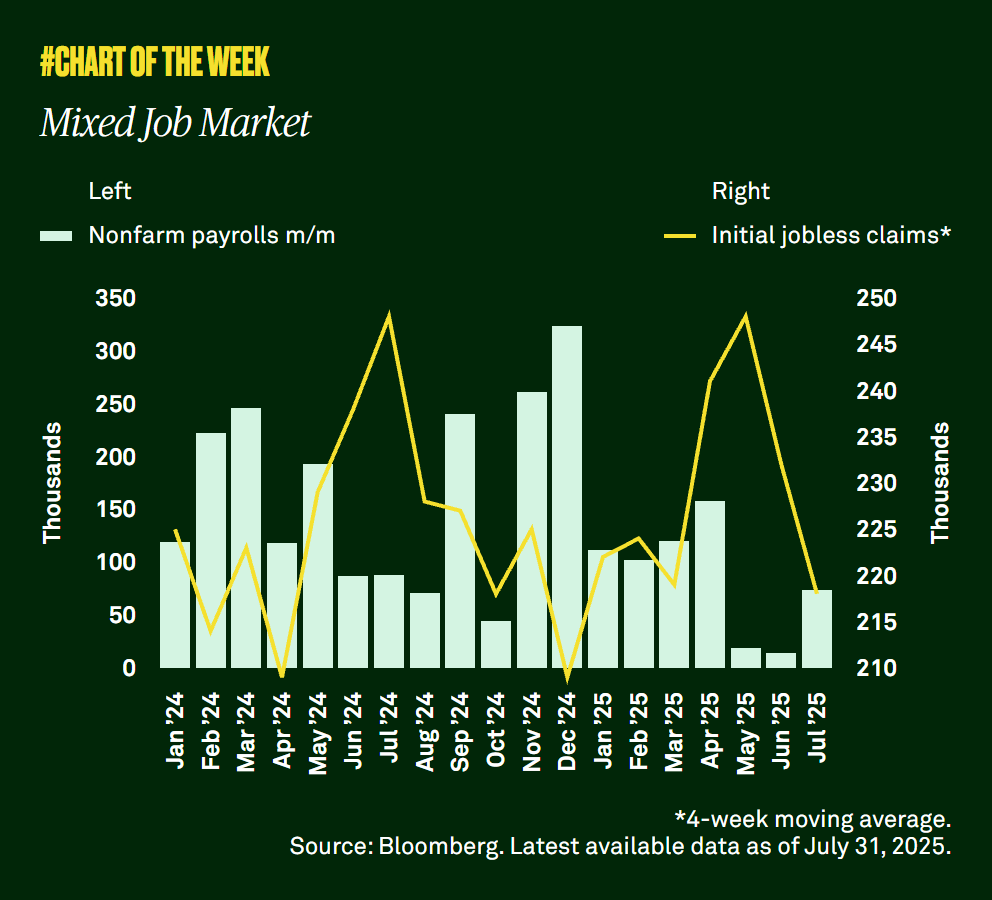
Today’s top macro-economic charts reveal key market shifts—learn how to interpret visuals for smarter investing and financial planning.

Macro Week in Charts: Visualizing Today’s Top Financial Trends
In the fast-paced world of finance, data alone can be overwhelming. That’s why charts and visuals are powerful—they transform complex economic information into patterns we can quickly interpret and act upon. This week, ten standout macro-economic charts have captured the attention of analysts and investors, each revealing an important market shift or economic signal.
Whether you’re a casual market follower or an active investor, understanding these visuals can help you position your portfolio for both current opportunities and future challenges.
Why Charts Matter in Finance
Charts are more than pretty pictures. They simplify complex datasets, making it easier to identify trends, reversals, and anomalies. A single line chart can summarize decades of market behavior, while a bar graph might highlight sectoral strengths or weaknesses in seconds.
For retail investors, visual tools can:
- Clarify the impact of macro events on specific markets.
- Reveal momentum shifts before they’re widely discussed.
- Provide context for making buy, sell, or hold decisions.
This Week’s Top Macro Trends in Charts
Here are the major themes analysts are talking about:
- Global Inflation Moderation
A downward slope in global CPI data is showing inflation cooling in several major economies. While the decline is gradual, it’s consistent—a sign central bank policies are starting to bite. - Bond Yield Inversions
Charts of U.S. Treasury yield curves highlight inversions between short- and long-term bonds, often viewed as a recession signal. The persistence of this inversion has kept recession debates alive. - Sector Rotation Signals
Sector performance bar charts reveal a shift toward defensive sectors like utilities and healthcare, while cyclical sectors such as consumer discretionary show weakness. - Commodity Price Rebounds
A spike in commodity indices—driven by energy and agricultural prices—suggests renewed inflationary pressure in certain sectors, even as overall inflation cools. - Currency Strength Trends
The U.S. Dollar Index chart shows strengthening over the past two weeks, impacting emerging market equities and global trade competitiveness. - Tech Earnings Growth
Charts tracking quarterly earnings growth in the tech sector show an uptick, with AI-related companies leading the charge. - Housing Market Softening
Price trend charts for residential real estate in key markets point to a gradual slowdown, partly due to higher mortgage rates. - Global Manufacturing PMI
Manufacturing PMI line charts remain below the neutral 50 level in many economies, signaling contraction in the manufacturing sector. - Cryptocurrency Market Cap Recovery
Crypto market cap charts show a steady recovery, led by Bitcoin and Ethereum, as investor sentiment improves. - Global Equity Market Breadth
Breadth charts indicate fewer stocks are driving index gains—a sign that market rallies may be less stable than they appear.
How to Read and Interpret These Charts
Understanding the story behind a chart requires more than just noticing an upward or downward slope. Ask yourself:
- What’s the time frame? A short-term rise may be insignificant in a long-term downtrend.
- What’s the context? Is the movement driven by seasonal effects, policy changes, or one-off events?
- What other indicators confirm this trend? Use multiple charts and datasets to validate your conclusions.
For example, a chart showing falling inflation should be cross-checked with wage growth data, commodity prices, and consumer sentiment surveys to get the full picture.
Practical Ways to Use Chart Insights
- Portfolio Adjustments
If defensive sectors are gaining momentum, consider rebalancing to include more of these stocks during uncertain market periods. - Hedging Strategies
A strong U.S. dollar might warrant reducing exposure to certain international equities or adding currency hedges. - Opportunity Spotting
A rebound in tech earnings may signal entry points for growth-focused investors. - Risk Management
Bond yield inversions and weakening manufacturing PMIs might prompt caution, leading to more cash reserves or safer investments.
The Balance Between Data and Action
While charts can be highly informative, they are tools—not crystal balls. Markets can defy historical patterns, and data can lag behind real-time events. The best use of charts is to guide your thinking, not dictate your every move.
Remember, macro-economic visuals work best when paired with:
- Company-specific research.
- Fundamental analysis.
- A clear understanding of your risk tolerance and investment horizon.
Final Thoughts
This week’s macro charts tell a story of a complex, transitioning global economy—cooling inflation but mixed growth signals, sector rotations, and renewed commodity pressures. By learning to interpret these visuals with a critical eye, you can turn static images into dynamic strategies.
In a market environment where speed and clarity matter, the ability to read the “language” of charts is an invaluable skill. Whether you’re investing for long-term growth or short-term opportunities, the charts of today could be the foundation for the decisions you make tomorrow.
